12 Jun, 2023Improving website feature helps seniors join strength and balance classes
An end-to-end process of the ‘Find a class’ feature on Live Stronger for Longer.
Interaction Design
UX
UI

Overview
Live Stronger for Longer is an ACC led initiative that aims to reduce the economic, social and personal impact falls have on older adults, their families and whānau, and their communities. This means reducing older adults’ risk of falling and getting a fracture if they fall.
The Live Stronger for Longer website acts as an information site to help educate the people of New Zealand, while also offering the ability to self-serve education and attend ACC approved strength and balance classes.
Problem space
I was brought onto this project to help facilitate the website refresh of the existing Live Stronger for Longer site. This case study represents a small part of the wider project, looking at how we might improve a key feature of the website - finding and booking into a strength and balance class.
During initial testing we found that the existing simple page was not as easily understandable by our older user groups who were not as digitally adept as our other user groups. So we set about finding a way that delivers a better guided experience for all.
Impact
During this project I was able to:
Deliver increased organisational understanding of older adults digital behaviours, enabling the Digital team at ACC to design more inclusive, accessible solutions that better meet the needs of this growing demographic.
Improve customer awareness and decision-making by enhancing the visibility of localised service options, resulting in higher engagement with relevant offerings.
Expand functionality for course providers within the ‘Find a class’ feature, enabling richer content delivery and improved customer access to resources - strengthening provider-customer connections.
Wider project impact:
Embed stakeholders in the user research process, fostering alignment between business goals and user needs. Leading to more strategic feature prioritisation and greater confidence in product decisions.
Reduce design-to-delivery timelines by 150% through the development and adoption of a scalable atomic design system — significantly accelerating product velocity across multiple teams.
Future-proof the product through a successful transition to the Silverstripe CMS platform by providing content author guidelines and a modular CMS experience.
Role
Digital UX Designer
Timeline
April - June, 2023.
Wider project timelines were over the space of a few quarters.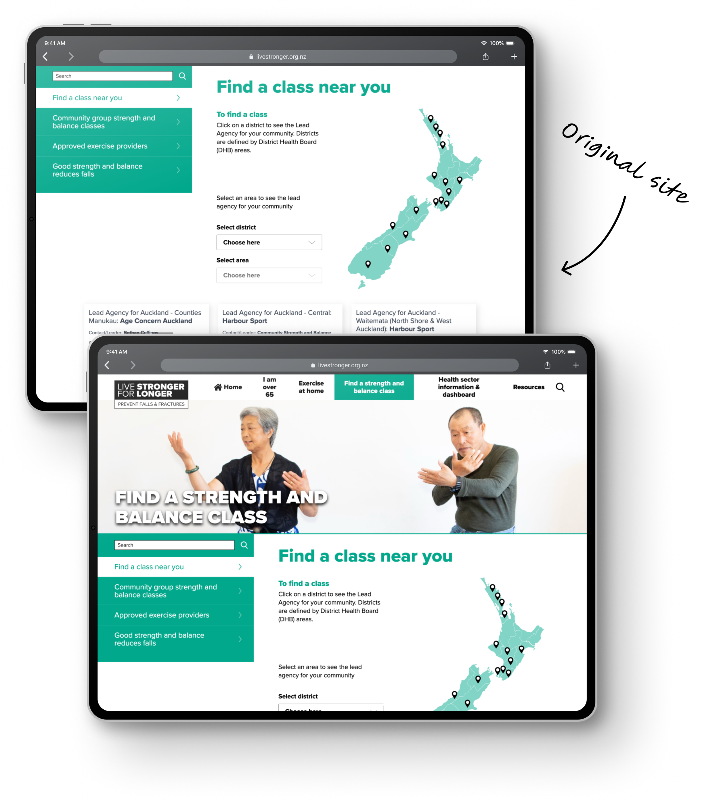
Screenshots from the pre-existing Live Stronger for Longer website — find a class feature.Business Objectives
Deliver a refreshed experience across the Live Stronger for Longer site
Engage with the customer base
Design-led objectives
Improve accessibility and usability for older adults users (55+)
Enhance content adaptability and track user engagement
Empower course providers to better service their audiences
Reduce delivery friction and align product development with user needs
Enhance visibility of local services for better customer engagement
Approach & strategy
Inclusive design for older adults
Conducted targeted research on digital behaviours of older users
Identified pain points in navigation, language and trust
Informed accessible UI updates and experience design
To enable the product team to build features that better reflect the needs of a core user group.
Localised customer engagement
Enhanced the visibility and clarity of local services within the UI
Supported users in identifying classes and services relevant to them
Improving engagement rates and reduced user drop-off in service selection.
Empowering course providers
Expanded functionality in the ‘Find a class’ feature
Allowed providers to add richer class details, resources and updates
Strengthening provider-customer connections and reduced dependency on support channels.
Embedded stakeholder research
Invited key business stakeholders into live research sessions
Built shared empathy and prioritisation confidence
Enabling more strategic product planning and alignment across departments.
Design system development
Created and implemented a scalable atomic design system
Standardised components and design patterns across a legacy product
Delivered a highly modular design system and content CMS guidelines
Reducing delivery timelines by 150% and improving design, development and content consistency.
Platform modernisation
Facilitated CMS guidelines alongside development team
Standardised components and design patterns with existing modern ACC experiences
Leveraging existing Silverstripe modules to help reduce timelines
Increasing long-term maintainability and future-readiness of the product as I rotate off the team.
Design process
Testing with Kaumātua
Along with a heuristic review of the existing website, I wanted to gather some customer feedback. I needed to understand the current state and how users currently navigate, did they find it easy and above all could they find a local class to attend.
Myself and the product team were invited to the National Kaumātua Conference, where we were able to set up a booth to engage with Māori seniors. Providing us with a way of engaging with a demographic that is relatively under designed for in the digital landscape.
At the conference myself and the team ran user testing sessions on various devices looking at the current navigation experience.

A screenshot from my heuristic review of the pre-existing experienceFirst pass designs - how could functionality help our users
With the feedback we gathered at the National Kaumātua Conference we could see that the current find a class tool was not delivering a great experience, as the information they were being asked was not clear enough.
I completed some wireframes making use of different existing modules, and some new with the purpose of creating an experience that helped to guide users through the journey rather than present people with a default search.
The thinking behind this was to teach people about the classes as they fill out information. The classes have a lot of information around them that a customer needs to know and a simple search doesn’t provide that.

Wireframe concepts used in Guerilla testing - concept 3 being the best testing conceptGuerilla testing
I set out to test with older adults in and around the city, to see which of the designs fit the need. We had a low budget for user-testing and needed a quick turn around on some of the choices we were making. As such Guerilla testing fit the bill — as I was able to utilise some of the existing ACC first aid packs and merchandise.
The aim for guerilla testing was that I wanted to find potential users that had no idea about the classes or the existing experience as this was the key audience of the end product. I wanted to test a customers first impression coming to the Find a class feature, knowing little to nothing about the process could they complete the task required.
At the end of the guerilla testing there was one wireframe that stood out above the rest. The one that guided users through the journey rather than a typical search pattern. This design had initially seemed as a bit of an overkill for the simple function, however within our testing we were able to see that a new user with no existing knowledge preferred the extra guidance and education along the journey.
Final build
Based on the results of the guerilla testing I set out pulling together some hi-fidelity designs to go over with the developers. This build required some more intricacies and technical nuances than the others and required closer dev/design engagement.
Having migrated to the Silverstripe CMS we were able to leverage some existing functionality from other CMS users to help facilitate a quicker build time and reducing maintenance costs going forward.
This feature was completed on the CMS and hidden from users until the rest of the website was completed to release as a big bang overhaul. This was due to some underlying technical issues within the CMS that required us to overhaul all old componentry to ensure a smooth release.

Final screens based on the outcome of Guerilla testing and user interviewsKey learnings and reflections
This work demonstrated how inclusive design, stakeholder collaboration, and scalable systems can elevate both customer outcomes and internal efficiency. Designing for older adults not only improved accessibility but influenced a broader cultural shift towards user-centred thinking at ACC.
It is commonly thought that a fully accessible design is good enough for the older audience of digital products. We assume that older adults rarely use mobile devices and are quite digitally inexperienced. However during our in-person user testing we found that while older adults were inexperienced with tablets, they all had great familiarity with smart phone devices. This was further backed with our 44% mobile traffic data point. We also assumed from this digital uptake that older users would be able to follow along with a simple pattern as most other digital users could. This is where we learnt the biggest impact, it’s not about how simple a process is, this user base needs to a helping hand to move through a process that might be simple to you or me. This was the catalyst for further exploration into guided processes that could potentially be seen as overkill for this simple function.
Overall, it was a valuable and highly educational experience working on this project, tackling accessibility, inclusivity and interaction design issues alike.
Business outcomes
150% increase in design-to-delivery speed
Improved accessibility and usability for older adults
Higher customer engagement with local services
Stronger content delivery by course providers and CMS authors
Department-wide adoption of research-led feature planning
Improved scalability and consistency through atomic design system
Confidence in product growth and scalability as designers rotate on and off product